Your First Section
In this tutorial, you'll build a hero banner section with a background, title, description, image, and a call-to-action button. By the end, you'll understand how Crane sections are structured and how content and design composables work together.
What You're Building
A hero banner that a store owner can customize through the Lightspeed editor:
- Background — solid color or gradient
- Title — customizable text, font, size, and color
- Description — multi-line text with styling
- Image — responsive hero image
- CTA Button — configurable label and link
Download Assets
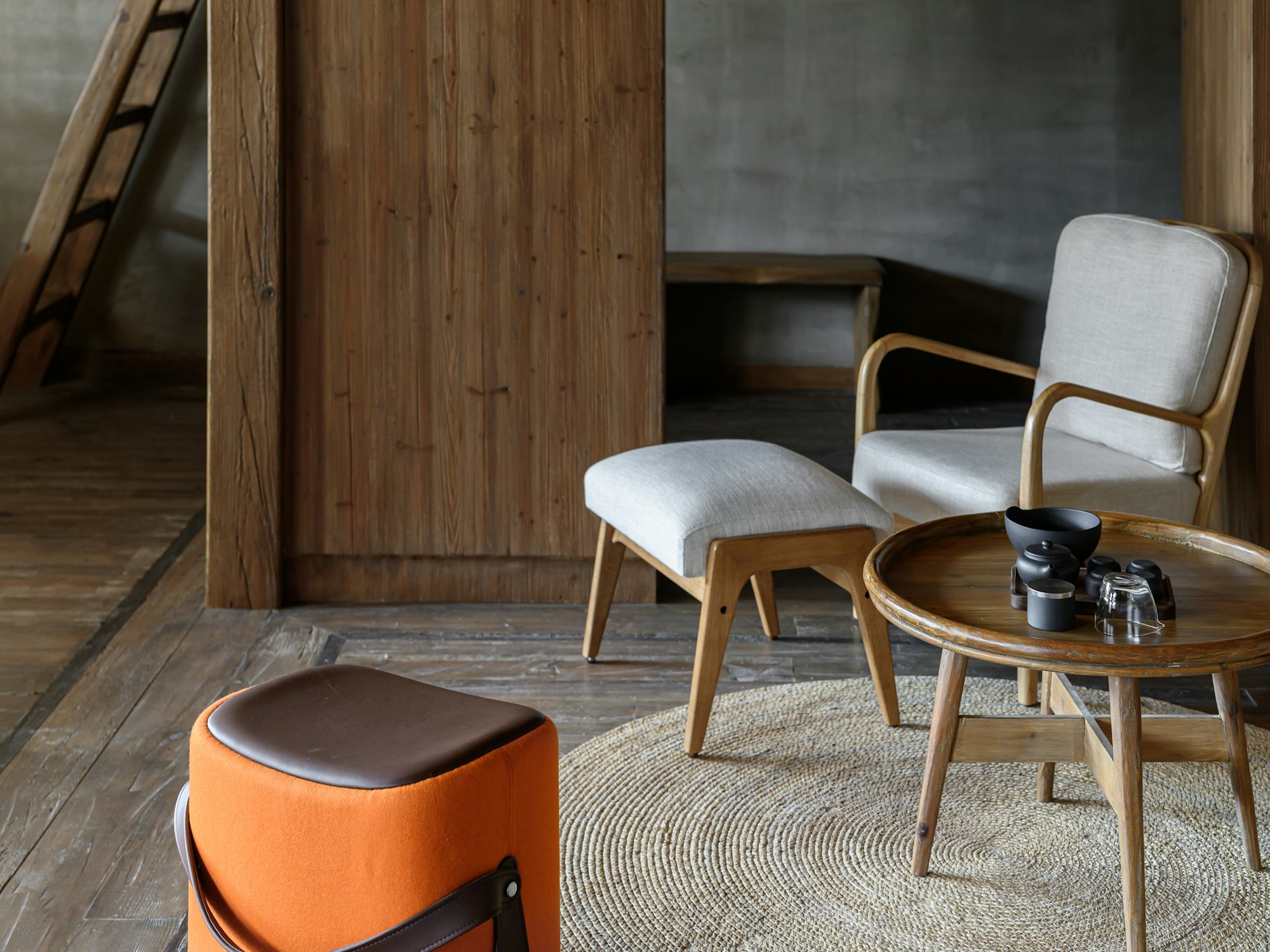
This tutorial uses sample images for the hero banner and showcase. Download them and keep them ready — you'll copy them into the right directories as you go:
- hero_webp-2000x1500.jpeg — high-resolution hero image
- hero_webp-200x150.jpeg — low-resolution hero image
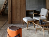
- hero_banner_section_showcase_1_preview.jpeg — showcase preview thumbnail
- reference_template_cover_image.jpeg — template cover image
Scaffold the Section
From your application root, generate a new section:
npx @lightspeed/crane@latest init --section hero-bannerThis creates the following structure inside sections/hero-banner/:
sections/hero-banner/
├── ExampleSection.vue       # Main Vue component
├── server.ts                # SSR entry point
├── client.ts                # Client hydration entry point
├── type.ts                  # TypeScript type definitions
├── settings/
│   ├── content.ts           # Content editor settings
│   ├── design.ts            # Design editor settings
│   ├── layout.ts            # Layout configuration
│   └── translations.ts      # Translation strings (i18n)
├── component/               # Sub-components used by the section
│   ├── button/
│   ├── image/
│   ├── selectbox/
│   ├── title/
│   └── toggle/
├── entity/                  # Shared types and enums
│   └── color.ts
├── assets/                  # Static assets (images, icons)
└── showcases/               # Showcase configurations (preview presets)
    ├── 1.ts
    ├── 2.ts
    ├── 3.ts
    └── translations.ts
Let's walk through the key files.
Entry Points
server.ts
The SSR entry point creates the Vue app on the server:
import { createVueServerApp } from '@lightspeed/crane-api';
import ExampleSection from './ExampleSection.vue';
import { Content, Design } from './type.ts';

export default createVueServerApp<Content, Design>(ExampleSection);
client.ts
The client entry point hydrates the server-rendered HTML in the browser:
import { createVueClientApp } from '@lightspeed/crane-api';
import ExampleSection from './ExampleSection.vue';
import { Content, Design } from './type.ts';

export default createVueClientApp<Content, Design>(ExampleSection);
Both entry points pass the Content and Design types as generics, ensuring full type safety across the SSR pipeline. These files rarely need changes beyond updating the component import.
Define Content Settings
Edit settings/content.ts to define what the store owner can edit. For our hero banner, we need a title, description, image, and button:
// settings/content.ts
import { content } from '@lightspeed/crane-api';

export default {
  hero_title: content.inputbox({
    label: '$label.hero_title.label',
    placeholder: '$label.hero_title.placeholder',
  }),
  hero_description: content.textarea({
    label: '$label.hero_description.label',
    placeholder: '$label.hero_description.placeholder',
  }),
  hero_image: content.image({
    label: '$label.hero_image.label',
  }),
  cta_button: content.button({
    label: '$label.cta_button.label',
    defaults: {
      title: '$label.cta_button.defaults.title',
      buttonType: 'HYPER_LINK',
      link: 'https://www.example.com',
    },
  }),
};
Each key becomes a content editor field in the Lightspeed admin panel. The content builder provides typed factory functions for each editor type. Labels use translation keys (defined in translations.ts) for i18n support.
Define Design Settings
Edit settings/design.ts to define the visual customization options:
// settings/design.ts
import { design } from '@lightspeed/crane-api';

export default {
  title_design: design.text({
    label: '$label.title_design.label',
    colors: ['#FFFFFF66', '#0000004D', '#00000099'],
    sizes: [18, 20, 22, 24, 26, 28, 30, 32, 34, 36, 38, 40],
    defaults: {
      font: 'global.fontFamily.body',
      size: 40,
      bold: true,
      italic: false,
      color: '#313131',
      visible: true,
    },
  }),
  description_design: design.text({
    label: '$label.description_design.label',
    colors: ['#FFFFFF66', '#0000004D', '#00000099'],
    sizes: [12, 13, 14, 15, 16, 17, 18, 20],
    defaults: {
      font: 'global.fontFamily.body',
      size: 18,
      bold: false,
      italic: false,
      color: '#313131',
      visible: true,
    },
  }),
  background_design: design.background({
    label: '$label.background_design.label',
    colors: ['#FFFFFF66', '#0000004D', '#00000099'],
    defaults: {
      style: 'COLOR',
      color: 'global.color.background',
    },
  }),
};
The design builder provides factory functions for each design editor type. You can specify allowed colors, font sizes, and defaults. These give the store owner control over fonts, colors, and the section background through the Lightspeed editor.
Define Translations
Edit settings/translations.ts to provide the human-readable strings for every $label.* key used in your content and design settings. Each language is a separate object keyed by locale code:
// settings/translations.ts
import { translation } from '@lightspeed/crane-api';

export default translation.init({
  en: {
    '$label.hero_title.label': 'Title',
    '$label.hero_title.placeholder': 'Enter the hero banner title',
    '$label.hero_description.label': 'Description',
    '$label.hero_description.placeholder': 'Enter a description for the hero banner',
    '$label.hero_image.label': 'Hero Image',
    '$label.cta_button.label': 'Call to Action',
    '$label.cta_button.defaults.title': 'Shop Now',
    '$label.title_design.label': 'Title Style',
    '$label.description_design.label': 'Description Style',
    '$label.background_design.label': 'Background',
  }
});
Every $label.* key referenced in content.ts and design.ts must have a corresponding entry here. The translation.init() builder takes an object keyed by locale code (en, nl, fr, etc.) — each locale maps every $label.* key to its translated string. This is what the store owner sees in the Lightspeed editor UI.
💡 Locales
The scaffolded section comes with en, nl, and fr locales pre-configured. You can add more locales by adding additional keys to the object.
Define Layout
Edit settings/layout.ts to define the available layouts for your section. Each layout is a different arrangement of the section's content — for example, text overlaid on an image vs. text below the image. For a getting-started hero banner, a single layout with empty overrides is sufficient:
// settings/layout.ts
import { layout } from '@lightspeed/crane-api';

export default [
  layout.init({
    layoutId: 'Hero_Banner',
    selectedContentSettings: [],
    selectedDesignSettings: [],
  }),
];
The file exports an array of layouts created with layout.init(). Each layout has:
layoutId— a unique identifier for the layoutselectedContentSettings— content setting overrides for this layout (empty means use the defaults fromcontent.ts)selectedDesignSettings— design setting overrides for this layout (empty means use the defaults fromdesign.ts)
💡 Design Overrides
Layouts let you offer multiple visual variations of the same section. When selectedDesignSettings is empty, the layout uses the base design settings as-is. You can add overrides with layout.designOverride.text(), layout.designOverride.background(), etc. to customize defaults per layout.
Type Definitions
Edit type.ts to infer TypeScript types from your settings:
// type.ts
import ContentSettings from './settings/content.ts';
import DesignSettings from './settings/design.ts';

export type Content = InferContentType<typeof ContentSettings>;
export type Design = InferDesignType<typeof DesignSettings>;
💡 Global Types
InferContentType and InferDesignType are globally available — no import needed.
Build the Component
Now for the main part — edit ExampleSection.vue to bring everything together:
<!-- ExampleSection.vue -->
<script setup lang="ts">
import { computed } from 'vue';
import {
useInputboxElementContent,
useTextareaElementContent,
useImageElementContent,
useButtonElementContent,
useTextElementDesign,
useBackgroundElementDesign,
Color,
} from '@lightspeed/crane-api';
import { Content, Design } from './type.ts';
// Content composables — reactive data from the editor
const title = useInputboxElementContent<Content>('hero_title');
const description = useTextareaElementContent<Content>('hero_description');
const image = useImageElementContent<Content>('hero_image');
const cta = useButtonElementContent<Content>('cta_button');
// Design composables — style settings from the editor
const titleDesign = useTextElementDesign<Design>('title_design');
const descriptionDesign = useTextElementDesign<Design>('description_design');
const backgroundDesign = useBackgroundElementDesign<Design>('background_design');
// Computed styles
const backgroundStyle = computed(() => {
if (backgroundDesign.background?.type === 'gradient') {
return {
backgroundImage: `linear-gradient(to right, ${backgroundDesign.background.gradient?.fromColor.hex}, ${backgroundDesign.background.gradient?.toColor.hex})`
};
}
return { backgroundColor: backgroundDesign.background?.solid?.color?.hex };
});
const titleStyle = computed(() => ({
fontSize: `${titleDesign.size}px`,
fontFamily: titleDesign.font,
color: (titleDesign.color as Color).hex,
fontStyle: titleDesign.italic ? 'italic' : 'normal',
fontWeight: titleDesign.bold ? 'bold' : 'normal'
}));
const descriptionStyle = computed(() => ({
fontSize: `${descriptionDesign.size}px`,
fontFamily: descriptionDesign.font,
color: (descriptionDesign.color as Color).hex,
fontStyle: descriptionDesign.italic ? 'italic' : 'normal',
fontWeight: descriptionDesign.bold ? 'bold' : 'normal',
}));
// Visibility checks
const showTitle = computed(() => titleDesign.visible && title.hasContent);
const showDescription = computed(() => descriptionDesign.visible && description.hasContent);
</script>
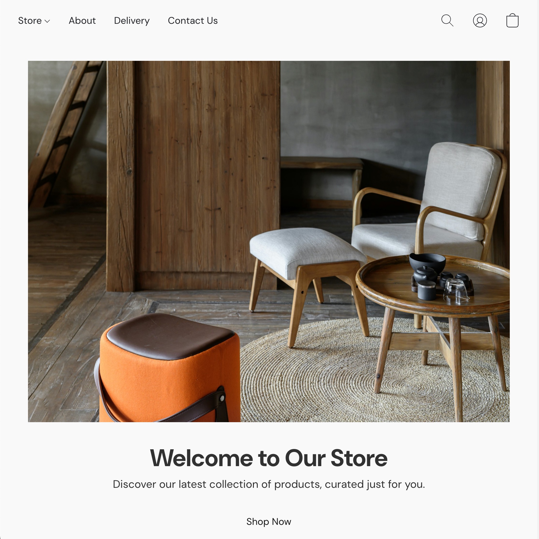
<template>
<section class="hero-section" :style="backgroundStyle">
<div class="hero-content">
<img
v-if="image.hasContent"
:src="image.highResolutionDesktopImage"
class="hero-image"
/>
<h1 v-if="showTitle" :style="titleStyle">
{{ title.value }}
</h1>
<p v-if="showDescription" :style="descriptionStyle">
{{ description.value }}
</p>
<button
v-if="cta?.hasTitle && cta?.hasLink"
class="cta-button"
@click="cta.performAction"
>
{{ cta.title }}
</button>
</div>
</section>
</template>
<style scoped>
.hero-section {
min-height: 500px;
display: flex;
align-items: center;
justify-content: center;
padding: 2rem;
}
.hero-content {
max-width: 800px;
text-align: center;
}
.hero-image {
max-width: 100%;
height: auto;
margin-bottom: 2rem;
}
.cta-button {
display: inline-block;
padding: 1rem 2rem;
text-decoration: none;
margin-top: 1rem;
cursor: pointer;
}
</style>Key patterns to note
- Content composables (
useInputboxElementContent,useImageElementContent, etc.) return reactive data from the store owner's editor input - Design composables (
useTextElementDesign,useBackgroundElementDesign, etc.) return style settings like font, color, and visibility hasContentandvisible— always check these before rendering to handle empty or hidden elements(titleDesign.color as Color).hex— color properties may be global color strings orColorobjects, so cast when accessing.hex- Settings use builder functions —
content.inputbox(),design.text(), etc. imported from@lightspeed/crane-api - Translation keys — labels use
$label.*keys defined insettings/translations.tsfor i18n support
Define a Showcase
Showcases are preview presets that demonstrate your section with pre-filled content and design values. They appear in the Lightspeed editor when a store owner browses available sections. You need at least one showcase.
Create showcases/1.ts:
// showcases/1.ts
import {
  content,
  design,
  showcase,
} from '@lightspeed/crane-api';

export default showcase.init({
  showcaseId: '1',
  previewImage: {
    set: {
      ORIGINAL: {
        url: 'hero_banner_section_showcase_1_preview.jpeg',
        width: 500,
        height: 300,
      },
    },
  },
  blockName: '$label.showcase_1.blockName',
  layoutId: 'Hero_Banner',
  content: {
    hero_title: content.default.inputbox({
      text: '$label.showcase_1.hero_title.text',
    }),
    hero_description: content.default.textarea({
      text: '$label.showcase_1.hero_description.text',
    }),
    hero_image: content.default.image({
      imageData: {
        set: {
          MOBILE_WEBP_LOW_RES: {
            url: 'hero_webp-200x150.jpeg',
          },
          MOBILE_WEBP_HI_RES: {
            url: 'hero_webp-2000x1500.jpeg',
          },
          WEBP_LOW_RES: {
            url: 'hero_webp-200x150.jpeg',
          },
          WEBP_HI_2X_RES: {
            url: 'hero_webp-2000x1500.jpeg',
          },
        },
        borderInfo: {},
      },
    }),
    cta_button: content.default.button({
      title: '$label.showcase_1.cta_button.title',
      buttonType: 'HYPER_LINK',
      link: 'https://www.example.com',
    }),
  },
  design: {
    title_design: design.default.text({
      font: 'global.fontFamily.body',
      size: 40,
      bold: true,
      italic: false,
      color: '#313131',
    }),
    description_design: design.default.text({
      font: 'global.fontFamily.body',
      size: 18,
      bold: false,
      italic: false,
      color: '#313131',
    }),
    background_design: design.default.background({
      style: 'COLOR',
      color: 'global.color.background',
    }),
  },
});
Key things to note:
showcase.init()— creates a showcase with a uniqueshowcaseIdpreviewImage— a preview thumbnail shown in the editor (place the image inassets/). Includewidthandheightto control the preview card's aspect ratioblockName— the display name (uses a translation key)layoutId— must match a layout ID defined insettings/layout.tscontent/design— usecontent.default.*()anddesign.default.*()builders (note:defaultnamespace, not the same builders as in settings)- Content and design keys must match the keys in your
settings/content.tsandsettings/design.ts
💡 Cleanup
You should remove 2.ts and 3.ts from the showcases/ folder. We don't need them for this section.
Showcase Translations
Create showcases/translations.ts with the translated strings for the showcase:
// showcases/translations.ts
import { translation } from '@lightspeed/crane-api';
export default translation.init({
en: {
'$label.showcase_1.blockName': 'Hero Banner — Default',
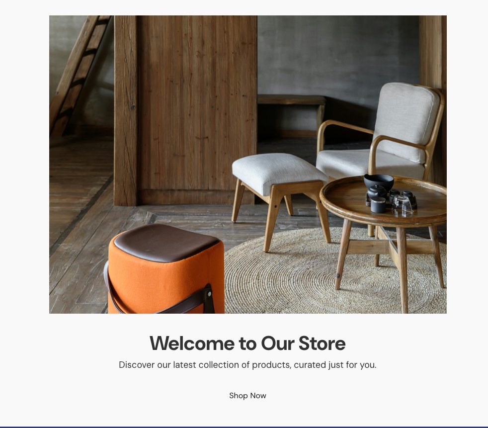
'$label.showcase_1.hero_title.text': 'Welcome to Our Store',
'$label.showcase_1.hero_description.text': 'Discover our latest collection of products, curated just for you.',
'$label.showcase_1.cta_button.title': 'Shop Now',
},
});💡 Translation Scope
Showcase translations are separate from section translations. Section translations (settings/translations.ts) provide labels for the editor UI, while showcase translations (showcases/translations.ts) provide the pre-filled content values for each showcase.
Next Steps
You now know how to create a custom section with content, design, translations, layout, and a showcase. Next, create a template to use it on a page:
- Your First Template — create a template and wire your hero banner into the home page
- CLI Usage — full command reference, workflow examples, and troubleshooting
- UI Composables — all available composables, DECK collections, translations, and advanced patterns